Skip to content Skip to navigation

Site Retired

As of May, 2022, this website is no longer updated and has been replaced with a static copy.

Megan Erin Miller's Blog Posts

Megan Erin Miller Posted by Megan Erin Miller on Thursday, February 21, 2013 - 2:55pm

This is the second post in my series titled Styling on Sites. Last time, we looked at all the theme settings we have available in Stanford Basic theme. This next post introduces the powerful module, CSS Injector, which lets us override the default styles of our site.

CSS Injector is how we take the look and feel of our Sites site to eleven. The CSS Injector module allows you to add CSS code to your site through the admin UI. It lets us create multiple "rules" that can apply to our whole site, or specific pages or sections of the site (based on path). The fundamental way CSS Injector works is by override. This important concept  is key in understanding how to theme your Drupal site (either through CSS Injector or through subtheme). Through a process of targetting specific elements on the page, and adding specificity in our CSS code, we can override the base theme's styles and replace them with our own.

For the purposes of this tutorial, we will focus on changing the container colors on the page.

When last we left my Sites website, it looked like this:

My site, before CSS injector

My goal in this tutorial is to create some basic styles that override the way the containers are showing up on the page.

First, we want to create a CSS Injector rule. Log in as an admin to your site, and you will find CSS Injector under Configuration > Development > CSS Injector (see below). If you don't see this module here, then you might need to enable CSS Injector from your Modules page first.

Where to find CSS Injector

Now we are going to create a new CSS Injector rule. I'm going to call it "Container Styles." Here is where the fun part begins. Using a browser such as Firefox or Chrome, we are going to use the developer tools (or Firebug) to "inspect" our page to figure out what the name of the container elements are that we want to override.

In Firefox, click the Firebug icon in the top right (or in Chrome, right click on an element and choose "Inspect element"). Use the inspector and hover over an element, like the main header box, and you will see the code pop up that is relevant to that element. See my example below:

Using Firebug to inspect an element

From here, I can see that my header container has an ID of "header" that I can target in my CSS. If you look closely in the Style pane in the inspector, you can see that the #header element is already being overridden by body.color4 #header, so this more specific element is what I need to override. (Styles listed in the Style pane are shown top to bottom, where those on top are more specific and override ones below. In this example, I see #header below body.color4 #header, thus I know that the longer name is overriding the shorter one.)

Now, CSS Injector loads its stylesheets first before the Drupal base theme stylesheets get loaded. This make overriding an element somewhat tricky, but I have one trick that works in most cases.

Instead of using this to specify your header ID:

body.color4 #header { background-color: transparent; }

I use this:

html body.color4 #header { background-color: transparent; }

In this way, I am using the html tag to quickly add a little bit of specificity to the element I am targeting.

So, if I wanted to turn all the container elements on my page a different color (in this case some will be transparent and others teal), here is the code I would place in my CSS Injector rule:

/* Header container */
html body.color4 #header { background-color: transparent; }

/* Navigation container */
html body.color4 #nav { background-color: #4A9AB5; }

/* Main body container */
html #main { background-color: transparent; }

/* Sidebar blocks containers */
html body.color4 .sidebar .block { background-color: transparent; }

/* Footer container */
html body.color4 #footer { background-color: #4A9AB5; }

And here's how it turned out:
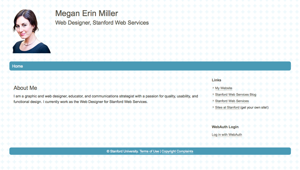
After adding CSS Injector styles to override my containers

In the next article in this series, we will continue to use CSS Injector to spiffy up our site, starting with link styles. Actually, I have something a lot cooler to show you. Open Framework!


Posted in:
Megan Erin Miller Posted by Megan Erin Miller on Tuesday, February 5, 2013 - 10:00am

Registration is now open for the Fourth Annual Stanford Drupal Camp. All sessions will be held April 5th - 6th, 2013 at the Stanford Law School.
https://drupalcamp.stanford.edu/register

Drupal Camp is a great opportunity for the Stanford Drupal community to come together and share new approaches, campus best practices, and love of Drupal.

Once you've registered, you are more than welcome to propose a session.
https://drupalcamp.stanford.edu/propose-session

If you have any questions, please contact drupalcamp@lists.stanford.edu

Happy Drupalling, and look forward to seeing you in April!

Posted in:
Tags:
Megan Erin Miller Posted by Megan Erin Miller on Friday, February 1, 2013 - 5:36pm

This is the first post in a multi-post series on styling your Sites site. In this post I'll get you aquainted with the Stanford Basic theme settings and what you can do without adding any additional CSS.

So, below is my personal site on Sites before I've changed any of the theme settings. To get this ready, I added some homepage content, a new site title and slogan, and a block in the second sidebar to list some of my links I want to share. This is a good start, but I want a custom look and feel. I have a logo I want to add, and a background pattern. 

My site, before

Most people get stuck here with their site on Sites and are dissatified with the way it looks. The theme you see here (aka the "skin" or "look and feel" of the site) is called Stanford Basic, and it is reall just that — a basic start for your site's theme. The best part about Stanford Basic is that it is such a great place to start if you want to customize your site's theme. In this series we will go deep into using CSS Injector to style your site, but in this post I simple want to introduce you to some basic changes you can make through the theme settings.

So, let's take a look at the theme settings for Stanford Basic. From your admin bar at the top, go to Appearance -> Settings -> Stanford Basic (see below for a screenshot).

Stanford Basic theme settings in the admin menu

Let's go through the settings that are available to us using this theme settings page. The first section lets us toggle on and off various elements from the page. This is a handy quick way to change some of the defaults. For example, if you wanted no logo, or to hide the site slogan, you could uncheck those here.

toggle display section

The next section enables us to use the default block S logo, or upload our own. I have a custom logo image I want to use, so I will unheck the checkbox and upload my own custom logo image.

Adding my custom logo

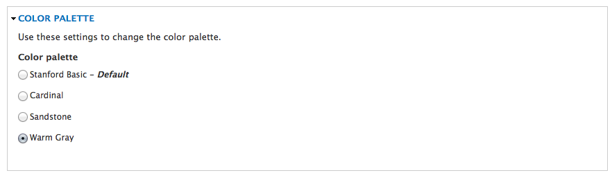
Next we can change the color palette to one of the ones provided by the theme. Here I've selected the warm gray palette.

Choosing a color palette

After this, we can adjust the layout of the site. I have chosen a wider sidebar in a fixed layout.

Choosing width of sidebar and layout

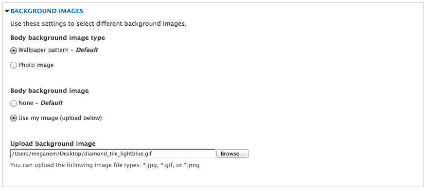
The next section lets us upload a background image and tile it if we wish. I have a repeatable diamond pattern I want to use, so I have uploaded that image here.

Adding a repeatable background image

Lastly, I'm going to change the border style to a rounded border style.

changing border styles

Save your configuration and viola! You can really do a lot just with a couple images and some custom theme settings.

My site, after

In the next post in this series, I will introduce you to using the CSS Injector module to begin customizing the styles on your site.

Posted in:
Megan Erin Miller Posted by Megan Erin Miller on Friday, January 18, 2013 - 9:54am

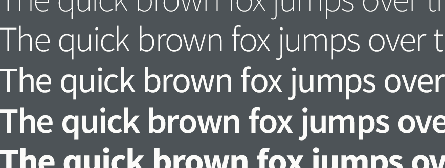
Source Sans Pro, a webfont created by Adobe that is now part of Stanford's identity guidelines for digital media, now has support for small caps. Read more in a recent (Nov. 2, 2012) update from Adobe on the adoption and development to-date for the font.

Source Sans Pro Small Caps

Posted in:
Megan Erin Miller Posted by Megan Erin Miller on Monday, January 7, 2013 - 5:17pm

It's a great time to be a web designer, as we have this explosion of web fonts at our finger tips. Tools such as Google Web Fonts make these available for free, and integrating them is easy on your site, even on sites.stanford.edu! In this tutorial, I'm going to go through adding a webfont to your Drupal site using CSS Injector (available on sites.stanford.edu), and developing a proportional typographic system for your site.

First things first, find a fun font that you like! I use Google Web Fonts extensively, as they make it so easy to add fonts to your site. One thing to look for is how many different styles are available in the web font you are choosing, and select the least number (but enough to be useful) of those styles to import into your site. Every web font style you add increases page load time, so bear that in mind.

For this exercise, I am going to use Source Sans Pro, as it is the recommended sans-serif webfont for Stanford sites. In Google Web Fonts, once you find a font you like, add it to your collection, then go to the "use" step to choose which styles you want to include in your webfont import.

Source Sans Pro

In this example (above) I have selected to include the Book, Normal, Normal Italic, and Semi-Bold styles. To grab these styles and import them into your site, use the @import option to grab the snippet of code to add to your CSS Injector rule (we will create this next).

Import source sans

There is one important thing you need to change in this URL for this to work on sites.stanford.edu! You must change the "http://" to be "https://" for this to work, as Sites relies on a secure connection.

OK! Next, we make a new CSS Injector rule on our site. Log in as an admin, go to Configuration > Development > CSS Injector (see below). If you don't see this module here, then you might need to enable CSS Injector from your Modules page first.

CSS Injector in admin menu

Once you've gotten to the CSS Injector section, create a new CSS Injector rule called "Custom Fonts" (or something to help you remember what it is). Paste the @import code (with the https://) into your rule and "Save and Continue Editing" (see below).

Adding CSS Injector rule

Now that you've imported your font, you can use it! Google provides example code for how to call on this font from your CSS. Here's one way to do it:

body { font-family: "Source Sans Pro", Arial, sans-serif; }

The trick with using CSS Injector though is that you have to be more specific in order to override a theme setting. So, for example, if you wanted to set this font for all header styles and the paragraph text, you will need to add specificity to your CSS. For example:

Instead of saying:
h1 { font-size: 3em; }

You will need to say:
html h1 { font-size: 3em; }

Now the trick to establishing a proportional typographic system is to first establish a base font size in pixels, then use ems to create all the additional font size definitions. Ems base themselves proportionally off of the initial pixel font size, thus you can create a type system that is proportional. That way if you change the base font size later, all the other sizes will scale proportionally. Here is my final CSS Injector rule:

@import url(https://fonts.googleapis.com/css?family=Source+Sans+Pro:400,600,400italic,300);

/* set root font size in pixels */
html body { font-family: "Source Sans Pro", Arial, sans-serif; font-size: 12px; } 

/* set font for all headers */
html h1, html h2, html h3, html h4, html h5, html h6 { font-family: "Source Sans Pro", Arial, sans-serif; } 

/* set proportional font sizes in ems */
html h1 { font-size: 3em; }
html h2 { font-size: 2em; }
html h3 { font-size: 1.5em; }
html h4 { font-size: 1.25em; }
html h5 { font-size: 1em; }
html h6 { font-size: 0.9em; text-transform: uppercase; }
html p { font-size: 1em; }

/* minimal extra styling */
html h1, html h2, html h3, html h4, html h5, html h6 { color: black; font-weight: 600; }
html h4, html h5, html h6 { letter-spacing: 0.02em; }

And here's how it turned out:

Proportional Type system

Posted in:
Megan Erin Miller Posted by Megan Erin Miller on Monday, December 17, 2012 - 5:07pm

Often when we hear that little voice in the back of our minds, "Wouldn't it be great to have a new website?" what we're really thinking is, "Wouldn't it be great to have a new look for our website." While getting a fresh style or "skin" for your site is absolutely a valid reason to want a redesign of our website, in most cases what will really make the most difference for our site visitors is to rewrite, restructure, and rethink the content. Now, this is no easy task, but I would argue that if you start with content first, your website will be immensely more successful at reaching and exceeding your goals.

So how do we think "content first?"

The first thing to get clear on when you are considering a website redesign is who your audience is, and what they need to do and learn on your site. Is your audience an external public trying to find directory information about people or programs? Are they students trying to connect with faculty and find courses? Try to articulate who they are and identify their main tasks and goals when using your website. Once you know your audience, you can tailor the message of your website.

Your audience will drive the message and focus of your content, which will in turn drive the structure and design of your site as well. Once you are able to identify your primary site audiences, you can approach each page in your site, and the information architecture (structure) of the site from the perspective of how to reach your audience. Here's a nifty checklist modified from Chapter Three's page table worksheet:

For each page in your site, answer the following questions:

  • Who is the most important audience for this page?
  • Who is the second most important audience?
  • What's the #1 message we want to get across on this page?
  • What things should a user be able to do on this page, or act on?
  • What buckets of information do we need on this page? Rank from most important to least important.

For a hypothetical departmental homepage, you might come up with this:

  • Who is the most important audience for this page?
    Prospective students
  • Who is the second most important audience?
    Press editors
  • What's the #1 message we want to get across on this page?
    That our department has an active community, creating relevant publications and projects
  • What things should a user be able to do on this page, or act on?
    Learn about the department, Read recent news, See upcoming events, Read featured stories about current students
  • What buckets of information do we need on this page? Rank from most important to least important.
    #1) featured student stories, #2) news and events highlights, #3) information about the department

This last bullet is important—make sure to consider your audience and messaging goals when ranking your buckets of information.

The next step is to create a list of the content that will go on your hompage and define what assets might be needed to create that content.

A content list for our hypothetical departmental homepage:

  1. Featured student stories (requires: image, title, teaser, link to read more)
  2. Recent news (requires: thumbnail image, date, source, title, link to read more)
  3. Upcoming events (requires: date and time, title, location, link to read more)
  4. About the department (requires: short paragraph with link to read more)
  5. Featured programs (requires: links to featured programs)
  6. Featured people (requires: thumbnail image, name, short bio, link to people profile)

Now, this order is important. The order we list things here (in order of most important to least important) is what will drive the placement of this content on the page such that we can highlight the most important information first. In this way, the design will truly be derrived from the content hierarchy.

Hierarchy of content in layoutUnderstanding our content hierarchy is extremely important when considering how our website will translate to mobile devices. When using responsive themes (the Stanford theme stack is responsive), we must pay attention to how the "desktop" layout of content will translate to mobile. In the list we created above, we want to make sure this content appears in the order we specified when viewed on a mobile device. To better understand how your responsive theme handles your content, you can use a tool like responsive.is to preview your page in various screen sizes. The Open Framework theme, which is at the base of the Drupal 7 theme stack at Stanford, will provide (soon) a useful block order overlay tool which tells you the order of hierarchy of blocks placed on a page. You can use this ordering to better understand how your content will shift when it is reduced down to a mobile screen size. If at all possible, it is best to consider a mobile first approach when creating your page layout—think first how your content will appear on mobile, then work your way up to desktop screen size.

Thinking of your content first might be a bit more work, but the results are worth it—a website that is driven by audience and a design that truly supports your communications goals.

For more information about responsive web design and how you can implement this in your Drupal site, check out Brian Young and my BADCamp 2012 presentation, "A 'content first' approach to designing responsive Drupal layouts using Twitter Bootstrap," or connect with us online at http://openframework.stanford.edu.

Pages

Subscribe to Megan Erin Miller's Blog Posts