Skip to content Skip to navigation

Site Retired

As of May, 2022, this website is no longer updated and has been replaced with a static copy.

Megan Erin Miller's Blog Posts

Megan Erin Miller Posted by Megan Erin Miller on Monday, April 7, 2014 - 9:06am

In this post, I continue my series on how to override Open Framework's default styles to get a more custom look-and-feel on your site. Last time we looked at how to override our typography styles. Today, we'll look at a grab bag of other things, including block styles, sidebar menus, and region styles.

Before we dive in, make sure you are familiar with the steps we took in using Firebug (or Chrome dev tools) and CSS Injector. Here's another post I wrote that introduces CSS Injector and Firebug in more detail.

Overriding Block Styles (aka "well")

Blocks are a foundational way of building a Drupal site. Open Framework comes with some default block styles, so lets look at how to override those.

The first thing we will need to do is make sure the Block Class module is enabled. Block Class lets us add classes to our blocks through the GUI. So, go to your Modules page, and find the Block Class module in the list and enable it if it isn't already.

block class

Once you've saved and enabled Block Class, you now should see a field when you configure a block, called "CSS class(es)." We're going to add the well class to this field and save our block.

block class field

So, here's what our block looks like – it has the default Bootstrap gray box around it (with rounded corners and an inner shadow). We want to change how this well class looks to better fit with our design.

default bootstrap well style

So, let's override the well class CSS with our own custom CSS:

/* Overriding well style */
.well {
  background: #E4EEF5;
  border: 1px solid #C2E0F2;
  -moz-border-radius: 0;
  -webkit-border-radius: 0;
  border-radius: 0;
  -moz-box-shadow: none;
  -webkit-box-shadow: none;
  box-shadow: none;
}

Now we can see our well has sharp corners, a flat blue background and border, and no shadow. (Note: I've included the vendor prefixes for border-radius an box-shadow here to be safe, but it's likely you will not need them in newer browsers.)

custom well styles

Sidebar Menu Styles

Let's say you have a custom menu block that you've placed in the sidebar. By default, this menu is not very attractive. The links are listed with bullets, the hover state adds a gray background, and the active state could be a little more obvious. Here's what it looks like by default:

default sidebar menu

For us to override these styles, we're going to need to not only target the links in their inactive state (when we aren't hovering over them), but we're going to have to target them for active, hover, and focus states. Drupal uses the .active class to indicate if you are currently on the page. In the screenshot above, I was on the homepage, thus the "Home" link was active (and black instead of pink). In the screenshot above, I was hovering over the "Resources" link, so we see that link in the hover state. The focus state is important also for those navigating your page with the keyboard. So, let's look at what we need to override in our CSS.

First, we will want to remove the bullets and add some default link styles. I've used Firebug to inspect and see that I need to override the .sidebar .nav selector.

/* Overriding sidebar menu styles */
.sidebar .nav {
   margin: 0;
}
.sidebar .nav li {
   list-style: none;
   margin: 0;
   padding: 0;
}
.sidebar .nav li a {
   padding: .5em 0;
   border-top: 1px solid #C2E0F2;
}
.sidebar .nav li.last a {
   border-bottom: 1px solid #C2E0F2;
}

In the code above, I start by stripping off the margins and padding from the list (ul.nav, and the list items - li). I remove the bullet style from the list items, and then I add some padding and borders to the links themselves. Here's what we've got so far:

sidebar menu draft 1

We still need to style the active, hover, and focus states for our links, so let's go ahead and add that:

.sidebar .nav li a:hover,
.sidebar .nav li a:focus,
.sidebar .nav li a.active {
   background: #E4EEF5;
   color: #000000;
}

In this example, I am making all these states look the same. Here's what we've got now – a blue background with black text for active, hover, and focus:

finished sidebar menu

Here's our complete CSS for styling our sidebar menus:

/* Overriding sidebar menu styles */
.sidebar .nav {
   margin: 0;
}
.sidebar .nav li {
   list-style: none;
   margin: 0;
   padding: 0;
}
.sidebar .nav li a {
   padding: .5em;
   border-top: 1px solid #C2E0F2;
}
.sidebar .nav li.last a {
   border-bottom: 1px solid #C2E0F2;
}
.sidebar .nav li a:hover,
.sidebar .nav li a:focus,
.sidebar .nav li a.active {
   background: #E4EEF5;
   color: #000000;
}

Region Styles

OK, the last thing I want to cover in this post is how to style entire regions of the page. For example, we might want the header and footer regions to have a different background color. First, we use Firebug to find what selector to target. In hovering over the header region, I see that I will need to override the .header class. Here's what my header region looks like right now:

header region by default

Let's add a light background and a border to the bottom. To do this, we will first need to override the margins and instead replace them with padding. This will make sure our background color stretches from the top of the screen. Here's what our CSS looks like:

/* Overriding the header region */
.header {
   margin: 0;
   padding: 30px 0;
   background: #E4EEF5;
   border-bottom: 1px solid #C2E0F2;
}

And here's how the styles look now – a light blue background and a subtle border on the bottom:

header region with styles

Now, if you wanted to separate the header region from the menu a bit, you could add back a bottom margin to the header region, which would space them apart a bit.

The same idea applies to other regions on the page. Here are some you might want to try overriding:

  • .site-footer (to override the footer region)
  • .site-main-menu (to override the main menu region)
  • .main (to override the middle area of the page)
  • body (to override the entire page background)

What's next

We've now covered most of the basics for overriding Open Framework, but there's still a bit of work to do to customize the responsive styles (when you load your site in smaller windows/screens. In the next post, I'll cover how to write media queries to target responsive styles in Open Framework.

Posted in:
Megan Erin Miller Posted by Megan Erin Miller on Monday, March 3, 2014 - 9:01am

In this post, I continue my series on how to override Open Framework's default styles to get a more custom look-and-feel on your site. Last time we looked at how to override the main menu styles. Today, we'll look at how to customize your typography.

Typography is one of those things that can really make your site stand out from the crowd. By spending time adjusting font size, weight, line height, and letter spacing, we can get a really beautiful website, even when the site is mostly composed of text. We can also explore using custom web fonts to add that special flair to our site.

Before we dive in, make sure you are familiar with the steps we took last time in using Firebug (or Chrome dev tools) and CSS Injector. Here's another post I wrote that introduces CSS Injector and Firebug in more detail.

Getting set up

In order to customize your typography, you'll want to first create a page where you can see all the examples of your typography in one place. This will help aid you in theming your site. I like to set up headings, paragraphs, and links in a somewhat realistic pattern to simulate an actual page. Here's the code I typically use to test out all my custom typographic styles (in Drupal, the <h1> would be automatically created for you as the page title):

<h1>Typography Demo</h1>
<h2>Heading Two</h2>
<p>Duis mollis, <strong>example bold text</strong> luctus, nisi erat porttitor ligula, eget lacinia odio sem nec elit. Sed posuere consectetur est at lobortis. Donec sed odio dui. Fusce dapibus, tellus ac cursus commodo, tortor mauris condimentum nibh, ut fermentum massa justo sit amet risus. Donec id elit non mi porta gravida at eget metus. Donec id elit non mi porta gravida at eget metus.</p>
<h3>Heading Three</h3>
<p>Duis mollis, est non commodo luctus, nisi erat porttitor ligula, eget lacinia odio sem nec elit. Sed posuere consectetur est at lobortis. Donec sed odio dui. Fusce dapibus, tellus ac cursus commodo, tortor mauris condimentum nibh, ut fermentum massa justo sit amet risus. Donec id elit non mi porta gravida at eget metus. Donec id elit non mi porta gravida at eget metus.</p>
<h4>Heading Four</h4>
<p>Duis mollis, est non commodo luctus, nisi erat porttitor ligula, eget lacinia odio sem nec elit. Sed posuere consectetur est at lobortis. Donec sed odio dui. Fusce dapibus, tellus ac cursus commodo, tortor mauris condimentum nibh, ut fermentum massa justo sit amet risus. Donec id elit non mi porta gravida at eget metus. Donec id elit non mi porta gravida at eget metus.</p>
<p><a href="http://people.stanford.edu/meganem">Example link</a></p>
<p><a class="btn" href="http://people.stanford.edu/meganem">Example button</a></p>

And here's what that looks like by default on my site:

Typography demo page - default

Create your CSS Injector rule

Because typography applies to my site as a whole, I might just want to add the styles for this into a "General Styles" CSS Injector rule. Either open your existing CSS Injector rule or create a new one. I like to first add a comment outlining what I am adding to my rule, like so:

/* Typography and Links */

By including descriptive comments, you will stay organized as your CSS grows.

Choosing a custom web font

For my site, I'd like to use a custom web font to add that special sauce to my look-and-feel. The easiest way to do this is to visit Google Web Fonts. This is such a great resource, and it's free!

What I like to look for in a web font is flexibility of style options within the font. For example, what we are looking for should be a font with multiple styles at different weights (bold, semibold, regular, light). This will give us the most flexibility in our design. As you browse, add fonts you like to your collection. Once you have a few fonts you like collected, review your collection and decide which one(s) you want to use. For this example, I am going to use a font called Lato.

Now, when you click on the "use" tab, be careful how many different styles you include so as not to increase your page loading time. I am going to include the Light, Light Italic, Bold, and Ultrabold styles to get started.

To use your font and call it from CSS Injector, you'll need to grab the @import code:

import code for custom font

BUT there is one important thing you will need to change! Because Stanford Sites is a secure server (https://), you need to add the "s" to your http:// as such:

@import url(https://fonts.googleapis.com/css?family=Lato:300,900,300italic,700);

OK. Paste your @import line at the top of your CSS Injector rule and save. Now you are ready to call this font in your CSS.

Set your custom font as the base font

In your CSS Injector rule, you now want to set your custom font as the base font for your site. To do this, refer to the Google Web Font documentation for how to call your font. You'll want to set this as a property of the body of your site, defining the font-family and the default font-weight, as such:

body {
    font-family: 'Lato', sans-serif;
    font-weight: 300;
}

Without much of any styles at all, we now see our typography demo page look different:

Custom font

Define your typographic hierarchy

Great! We now have set our custom font as the base font for our site. Now we want to make it look great. The first thing to think about when styling typography on the web is creating a hierarchical typographic system. This means that all our headings and base font are proportional and balanced, so that the eye sees the hierarchical difference between a major heading and subheadings and the body font.

To get started, we first need to set a base font size for the whole site in pixels. For example, on my site, the Lato font is a bit small by default, so I am going to increase it:

body {
    font-family: 'Lato',sans-serif;
    font-weight: 300;
    font-size: 17px;
}

The problem is we also need to define a line-height to give our text more breathing room. See how the lines are so squished?

To do this, we will define line-height proportionally using em units. An em unit is a relative unit, where 1em is equal to the base font size set in pixels. This lets us create more proportional font sizes. For example if we wanted a ratio of 1:2 between our paragraph and heading, we could define the size of the paragraph (by setting a base font size on the body as we have done) to 17px, and then set the heading font size equal to 2em (i.e. 2*17px). So, we can do the same with line height.

body {
    font-family: 'Lato',sans-serif;
    font-weight: 300;
    font-size: 17px;
    line-height: 1.5em;
}

And this is what we get:

Much nicer!

So, I'm going to do the same thing with all my heading styles to establish a proportional typographic system using em unit measurements, in addition to setting a default font-weight for all my headings, as such:

h1, h2, h3, h4 { font-weight: 700; }
h1 { font-size: 2.5em; }
h2 { font-size: 2em; }
h3 { font-size: 1.5em; }
h4 { font-size: 1.25em; }

Styling your links

Another thing that really can make your site stand out is creating a custom link style. For example, I want my links to be bold and purple, and I would like my button styles to be flat and not the default Bootstrap 3D effect. When styling links, the only trick is you have to style the default link and the link states (hover and focus), so that your link changes when you hover or tab to it. Here's what I've come up with:

a {
    color: #a41eb3;
    font-weight: 700;
}
a:hover, a:focus {
    color: #333333;
    text-decoration: underline;
}
a.btn {
    background: #a41eb3;
    padding: 0.5em 1em;
    color: #ffffff;
    border: none;
    -moz-text-shadow: none;
    -webkit-text-shadow: none;
    text-shadow: none;
}
a.btn:hover, a.btn:focus {
    background: #333333;
    color: #ffffff;
}

And here's what that looks like in the inactive and active state:

link styles

Now, you can go a little crazy with link styles, defining rounded corners, borders, etc. Have fun, but remember, links are your primary call to action. They should be easily distinguished from your body text, and not be hard to read.

Our final CSS Injector rule

Here's what our complete, final CSS Injector rule looks like:

/* Typography and Links */
@import url(https://fonts.googleapis.com/css?family=Lato:300,900,300italic,700);

body {
    font-family: 'Lato',sans-serif;
    font-size: 17px;
    font-weight: 300;
    line-height: 1.5em;
}
h1, h2, h3, h4 { font-weight: 700; }
h1 { font-size: 2.5em; }
h2 { font-size: 2em; }
h3 { font-size: 1.5em; }
h4 { font-size: 1.25em; }

a {
    color: #a41eb3;
    font-weight: 700;
}
a:hover, a:focus {
    color: #333333;
    text-decoration: underline;
}
a.btn {
    background: #a41eb3;
    padding: 0.5em 1em;
    color: #ffffff;
    border: none;
    -moz-text-shadow: none;
    -webkit-text-shadow: none;
    text-shadow: none;
}
a.btn:hover, a.btn:focus {
    background: #333333;
    color: #ffffff;
}

Going further

This is just a basic set of styles to help you get off on the right foot with your typography. Here are some things you could consider doing to customize your typography even further:

  • Make sure to define line heights for all your headings (test this out by trying really long headings and see how they wrap to two lines on a small screen)
  • Adjust margins above and below your headings (add more spacing to make it easier to scan the sections of your page)
  • Adjust font weights or colors for your headings
  • Try a different but complimentary font family for headings vs. your body font (adds some variety, and can be a cool, bold look)
  • Define styles for other text classes in Open Framework: descriptor, caption, credits, summary

What's next

In the next post, we'll look at a grab bag of other common components in Open Framework, like block styles, sidebar menus, and the general page regions.

Posted in:
Megan Erin Miller Posted by Megan Erin Miller on Thursday, February 13, 2014 - 11:25am

We are excited to announce that registration and session proposals are now open for Stanford Drupal Camp 2014!

Registration is now open for the Fifth Annual Stanford Drupal Camp. All sessions will be held April 18th - 19th, 2014 at the Stanford Engineering Quad.
https://drupalcamp.stanford.edu/register

Drupal Camp is a great opportunity for the Stanford Drupal community to come together and share new approaches, campus best practices, and love of Drupal. We hope you consider attending, whether you are new to Drupal, a sitebuilder, or developer.

Once you've registered, you are more than welcome to propose a session. We will have tracks for academic, business/PM, design/theme, development, new-to-drupal, site-building, and Stanford-specific. How-to's, panels, case studies, and more are all welcome!
https://drupalcamp.stanford.edu/propose-session

If you have any questions, please contact drupalcamp@lists.stanford.edu

Happy Drupalling, and look forward to seeing you in April!


Posted in:
Megan Erin Miller Posted by Megan Erin Miller on Monday, January 20, 2014 - 9:00am

In this series of posts, I'm going to share some tricks to quickly override some of Open Framework's default styling, such as the main menu, text, and link styles. For anyone who wants a quick way to get to a custom design on Stanford Sites, these posts should get you started on the right path. In this first post we'll cover how to customize the main menu.

First, I'll just review some basics before we get started. If you are familiar with CSS Injector and Open Framework, you can skip down to the section, "Overriding Open Framework Styles."

What is Open Framework?

Open Framework is the base theme provided on Stanford Sites hosting environment for Drupal 7. It is a "plain vanilla" theme which lets you more easily create a custom design. Open Framework is the base theme used in Stanford's family of Drupal themes, which you can check out at http://drupalthemes.stanford.edu. Learn more about Open Framework and how to get started using the theme on the Open Framework website, and in particular the Open Framework User Guide.

How are we going to override Open Framework styles?

We are going to use a module called CSS Injector to add our own CSS code to our Drupal site through the admin UI. CSS Injector lets us create multiple "rules" that can apply to our whole site, or specific pages or sections of the site (based on path). The fundamental way CSS Injector works is by override. This important concept  is key in understanding how to theme your Drupal site (either through CSS Injector or through subtheme). Through a process of targetting specific elements on the page, and adding specificity in our CSS code, we can override the base theme's styles and replace them with our own.

How do I set up a CSS Injector rule?

To set up a CSS Injector rule, log in as an admin to your site, and navigate to CSS Injector under Configuration > Development > CSS Injector. (If you don't see this module here, then you might need to enable CSS Injector from your Modules page first.) Click "Create a new rule" and name it something descriptive of the styles you want to put there (e.g. "General Styles" or "Main Navigation"). You can then choose to have your rule applied to the whole site (that is the default setting), or enter a path to make the rule apply to a certain page or section of your site. In order to save your rule, you must place some CSS code in the rule, so I usually just place a comment in to get started:

/* General Styles */

Overriding Open Framework Styles

OK, now that we've gotten set up and oriented, we can start working on overriding Open Framework's styles, because, let's face it. Everyone wants their site to be a little unique. So, we're going to do that with custom typography, colors, and treatments.

Overriding the Main Menu

The main menu is one of those dead giveaways that you are using a Bootstrap site, so let's first take a look at how to strip some of the "Bootstrappy" style from the navbar.

Here's what your main menu should look like by default:

OFW main menu by default

Some of the things we're going to want to change are the main navbar container styles (removing the background image, border, and shadows) and the active and hover states for our menu items. So, in order to figure out how to change these things, we'll use a tool like Firebug or Chrome Dev Tools to inspect each element on the page. Let's start with the overall navbar container first. When I inspect this element, here's what I see:

Inspecting the navbar element

From this inspection, we can see there is a CSS class, "navbar-inner" that we will want to target to override the main menu container styles.

In your CSS Injector rule, here's the code you'll need to strip the Bootstrap styles from this navbar-inner element:

/* Main Menu Overrides */

.navbar-inner {
    background-color: transparent;
    background-image: none;
    border: medium none;
    -webkit-box-shadow: none;
    -moz-box-shadow: none;
    box-shadow: none;
    padding: 0;
}

Our main menu should now look like this:

Main menu without navbar-inner styles

Note that you'll need to be careful to include the vendor prefixes for CSS3 properties like box-shadow, text-shadow, etc. If you're not sure whether to include a vendor prefix, do a quick Google search on the CSS property, or consider using a site like PrefixMyCSS.com

OK, next we want to inspect the active and hover states for our menu items. Using the inspector, hover over the active state item, in my case, the Home item in the menu. Here's what I see in Firebug:

Targeting the active state

This one is a little more complicated, as there are two lines of CSS I will need to override, this one that defines styles for the active state menu item:

.navbar .nav > .active > a, .navbar .nav > .active > a:hover, .navbar .nav > .active > a:focus

and this one that defines default styles for all menu items:

.navbar .nav > li > a

Upon further inspection of the hover state for the other menu item ("Resources"), we discover that there is another additional line of CSS we will need to target those items that are not in the active state:

.navbar .nav > li > a:focus, .navbar .nav > li > a:hover

Since I will want my hover state to match my active state, I will just combine this last line with the first one I found when defining my CSS rule. If you want your active state to look different than the general hover state, then keep these two separate.

The things we'll want to override on these menu items are the background color, the text shadow, the color of the text, and perhaps the padding as well. Here's what our full CSS Injector rule should now look like to override the navbar-inner container and the menu items (scroll to see all code):

/* Main Menu Overrides */

.navbar-inner {
    background-color: transparent;
    background-image: none;
    border: medium none;
    -webkit-box-shadow: none;
    -moz-box-shadow: none;
    box-shadow: none;
    padding: 0;
}

/* Overriding active and hover states for menu items */
.navbar .nav > .active > a, .navbar .nav > .active > a:hover, .navbar .nav > .active > a:focus,
.navbar .nav > li > a:focus, .navbar .nav > li > a:hover {
    background-color: #333;
    color: #FFF;
    -webkit-box-shadow: none;
    -moz-box-shadow: none;
    box-shadow: none;
}

/* Overriding default menu item styles */
.navbar .nav > li > a {
     padding: .5em 1em;
     -webkit-text-shadow: none;
     -moz-text-shadow: none;
     text-shadow: none;
}

Here's what our main menu now looks like:

main menu with active and hover states defined

If you want to take your main menu styles further, just edit or add to the CSS properties we've defined above. Here are some things you could consider changing:

  • Colors (background color of navbar, background colors for active/hover/default menu items states, font color)
  • Typography (you might want a custom font for your menu items, or adjust the font sizes)
  • Spacing and padding (you might want more or less padding around your menu items, or add margin in between the items to create space)
  • Rounded corners (you might want a softer edge on your menu items and consider adding rounded corners to your menu items)

What's Next

In the next post, we'll cover ways to override the default typography of your site, from headings to paragraphs to link styles.

Posted in:
Megan Erin Miller Posted by Megan Erin Miller on Friday, December 20, 2013 - 9:05am

2013 has been a fantastic year! The Stanford Web Services team wishes you happy holidays over the winter break! We'll see you in 2014!

The SWS team at our open house in Laurel

Posted in:
Megan Erin Miller Posted by Megan Erin Miller on Thursday, December 19, 2013 - 9:00am

At the beginning of November, I was fortunate to be able to participate in Adaptive Path’s User Experience Intensive (UXI for short). The event consisted of four solid days of workshop-infused learning, where we covered new design principles and tools for design strategy, design research, service design, and interaction design.

Now that I've had a month to let UXI sink in, I wanted to reflect a bit on what I learned, and on the format of the event.

Workshop Learning

Each day during UXI, we worked as teams with whoever was sitting at your table (teams of 5-8). Together, we brainstormed, mapped, and built prototypes. Each day, we had about four exercises to do as a team which helped us solidify our learning experience and internalize some of the concepts we were learning. This tactile, hands-on approach to learning new skills really worked well and was especially well-suited to learning in the design field. Some of these skills are hard to practice, so having pre-devised scenarios that gave us the right information to practice each new skill was really helpful.

The Value of Teams

One of the most valuable things I got out of UXI was the experience of getting to work with designers from around the nation (and world!). By deliberately placing myself in a new group of people each day, I got a chance to experience working with different personalities and backgrounds. For me, this was the first time I’ve really had a chance to work with with groups of other designers. On my team at SWS, I am the solo designer, and although I’ve worked to build my network of colleagues in the design field and had some opportunities for collaboration across units, from a day-to-day perspective, I don’t get to collaborate with other designers as much as I’d like. So UXI gave me a great opportunity to think about how I might fit into a larger team of designers and possibly take on a leadership role.

All that said, I also realized how fortunate I am to have a close-knit team that cares about user experience at every level. From developer to project manager, UX is core on our team and it is a joy to work in that kind of environment. I realized that I don't need to work on a team of designers to get the kind of feedback I need from my team, it's all about how you ask for that feedback and structure your conversations. Working with other designers at UXI helped me see some of the "shortcuts" us designers use to communicate to each other, but there is nothing special there that can't be brought into diverse team situations. It's just about learning new methods for communicating.

Service design workshop example

Example of one of the service design artifacts my team made...

Service Design

The most interesting part of UXI for me was the day on Service Design. As we move to a more cross-platform, multi-channel world, designers are no longer just responsible for the look and feel of one product. Our products are now becoming services, and it is the experience of the whole service that influences our customers. I find myself more and more interested in this approach to design, where the big picture is present and influences the micro-interactions. But to make this work, designers need to take a more active role in the business, engaging in strategic discussions and helping to define the goals of the organization as a whole. We can’t do this in a silo, and sadly as I learned from many of my fellow UXI participants, many companies still approach design in this way, isolating it from development, from marketing and operations. However, it did sound to me that companies are now more and more seeing the value of design at the core of their business. This is a huge mind shift, but it is happening, and as we move towards a more design-focused business model, we have more of a chance to participate in service design.

For me, going forward, I am formulating a plan to apply these new skills I learned from UXI, and particularly a service design approach to my work with Stanford Web Services. The more we can, as designers, understand the business as a whole and tie our strategic design work into business goals, the more opportunities we will have to practice a service design approach.

To conclude, I would highly recommend UXI to any designer looking to build their toolkit, expand their designer network, and move into doing more strategic design work. Learn more at http://ux-intensive.com

Megan Erin Miller Posted by Megan Erin Miller on Monday, October 14, 2013 - 9:03am

We are excited to announce the upcoming October 19th release of our updated mobile-responsive Drupal 7 themes:

  • Open Framework
  • Stanford Framework*
  • Stanford Wilbur*
  • Stanford Jordan*

* Stanford-branded themes are available by request for official university group and department websites.

These updated themes will be available starting October 19th  for websites hosted on Stanford Sites, as well as by download for websites using other hosting services. If your site is on Stanford Sites and is already using one of these themes, you will get the updated theme enabled automatically.

To see demos of each theme and request use of a theme, visit http://drupalthemes.stanford.edu.

Changelog

Below are improvements made to the themes since the last release (April 2013).

Open Framework

Accessibility improvements

  • Added accessibility improvements to search box
  • Added accessibility improvements to skip navigation links

New functionality

  • Added theme option for displaying main content before sidebar content in mobile
  • Added equal-height column behavior via "column" class
  • Added responsive support for iframes and video players via the "video-player" class

Bug fixing

  • Added logic to node.tpl.php to not output the node content if it is empty
  • Added jQuery Update module compatibility in core jQuery replacement behavior
  • Updated theme option logic for showing and hiding of breadcrumbs
  • Fixed theme option for using a photo image for body background

Updated packages

  • Updated to Font Awesome 3.2.1
  • Added Font Awesome IE 7 support
  • Updated HTML5 Shiv to version 3.6.2
  • Updated jQuery migrate to version 1.2.1

Style/Cross-browser improvements

  • Restored Bootstrap's pull-right class float:right behavior blocks in the navigation region
  • Updated CSS classes for float-right, collapsible fieldsets, and images
  • Added collapsed class to navbar
  • Made search box styles work outside of the search box region
  • Made float styles available in WYSIWYG preview

Stanford Framework

Accessibility improvements

  • Added accessibility improvements to search box
  • Added accessibility improvements to skip navigation links
  • Increased contrast for primary link color to meet color contrast guidelines

Style/Cross-browser improvements

  • Added support for content styles to show in WYSIWYG preview
  • Added "active-trail" styles for nested menu items
  • Updated mobile display of site titles first and second line content
  • Made it harder to accidentally change Stanford brand bar styles
  • Miscellaneous styles cleanup on menus, block elements, and pager
  • Changed all instances of bold to font-weight:600; for cross-browser support
  • Updated styles on Admin Shortcuts region
  • Optimized the display of main menu items in IE 8

Stanford Wilbur

  • Optimized Stanford logo images in brand bars for retina displays
  • Added new "block-title-style" class for making h2 inside a block look like the block title
  • Added "active-trail" styles for nested menu items
  • Removed max-width on block well images

Stanford Jordan

  • Optimized Stanford logo images in brand bars for retina displays
  • Added new "block-title-style" class for making h2 inside a block look like the block title
  • Added "active-trail" styles for nested menu items

Have a concern?

Stanford Web Services creates and centrally maintains Stanford’s Drupal 7 themes on a quarterly update schedule. If you have any questions, please file a HelpSU request at http://helpsu.stanford.edu/helpsu.cgi?pcat=webdesign and we will respond as soon as possible.

Posted in:
Tags:
Megan Erin Miller Posted by Megan Erin Miller on Tuesday, October 1, 2013 - 9:05am

Welcome to Imagery 101! Last time we looked at how to prepare your image for the web. In this post, we'll learn how to add your image to your website so that it is accessible.

Images are already about accessibility

Having good imagery on your site that truly serves the purpose of your content can actually improve the overall accessibility of your site. Here's a snippet on this topic from the Web Accessibility in Mind (WebAIM) website:

Some people think that graphics are bad for accessibility. The truth is that graphics can be of great benefit to the accessibility of a web page by providing illustrations, icons, animations, or other visual cues that aid comprehension for sighted individuals. Too often we forget that when we design for people with disabilities, we are not designing only for the blind. We must consider disabilities of all types. Graphics can be especially useful to individuals with certain reading disabilities, learning disabilities, attention deficit disorders, or cognitive disabilities.

Using imagery to enhance the accessibility of your content can be a big win for you and your visitors. Think strategically about how images can make the content of your site more accessible. A wall of text is not necessarily the most accessible format for your content.

Purposeful imagery can greatly improve accessibility of your content, but we will also want to make sure that the images we add are accessible in and of themselves. By considering things such as alternative (alt) text, long descriptions, color and contrast, minimizing text within your images, and avoiding images that can cause seizures, you can make sure that the imagery on your site is accessible to visitors with disabilities (e.g. low vision, color-blindness, or blindness) or those who have turned off images in their browser. Working to make your images accessible also helps search engines better index the content on your site, which can improve your SEO (Search Engine Optimization).

I'm going to go into a little detail here on each of these image accessibility considerations.

Writing good alternative (alt) text

Alternative text (or the alt attribute on the image tag, e.g.: <img alt="alternative text here" />) is used to explain the purpose of an image to those who are using screen readers or have images disabled in their browser. Unfortunately, we don't necessarily always want alternative text. To better understand this, I like to use this handy decision tree (below) to decide whether my image needs alt text. I've added some examples into the decision tree below to hopefully make it a little more useful.

Follow the decision tree to figure when to provide alt text:

  • Is this image the only content of a link or form control? (For example, an icon or graphic representing a button, such as the home icon that often is a link to your homepage)
    • Yes: Use the alt attribute to communicate the destination of the link or action taken
    • No: Continue on!
  • Does this image contain text? (For example, a "Make a gift" button graphic)
    • Yes:
      • If the text in the image is also present as real text nearby, use an empty alt attribute.
      • Otherwise, if the image is the only source of that text, then use the alt attribute to include the communicative text of the image (not text included for visual effect)
    • No: Continue on!
  • Does the image contribute meaning to the current page or context? (For example, your image might add specifics to a topic on the page, like a photograph of your staff working on a specific project described in the page)
    • Yes, and it’s a simple graphic or photograph: the alt attribute should briefly describe the image in a way that conveys that meaning.
    • Yes, and it’s a graph or complex piece of information: include the information contained in the image elsewhere on the page.
    • Yes, but a suitable alt text is unknown at the time of publication (for example on a photo upload site): provide a caption for the image.
    • No: Continue on!
  • Is the image purely decorative or not intended for the user? (For example, a pattern graphic or an unrelated landscape photo used to add color to the page)
    • Yes: Use an empty alt attribute.
    • No: Continue on!
  • Image use not listed above or unsure about what alt text to provide?

When to write long descriptions

When your image is too complex to describe in short alternative text—for example, if the image is of a chart, graph, or infographic—you will want to provide a longer description of the contents of the image in addition to the short alternative text. A long description should provide all the information available through the complex graphic, but in text form. For example, if your graphic shows a chart tracking growth over time, your long description should describe what the chart is showing and list the values of growth for each unit of time. The reason we want this kind of detail for a complex graphic is that our graphic in this case is conveying critical information. The chart itself contains data that the user should be able to access. If they are blind or have other disabilities, we need to give them another way to access that data.

There are a couple ways to provide long descriptions:

  1. Provide a long description elsewhere on the page, such as a caption.
  2. Use a normal hyperlink to link to another page that contains the long description.
  3. Provide a link to a long description via the longdesc attribute, which can be added to the <img> tag.

To learn more about each of these methods, visit the WebAIM page on long descriptions.

Color and Contrast

Similar to the long description, when we have critical information being conveyed through our graphic (in this case maybe a chart or infographic), we want to consider disabilities such as color blindness and low vision. Make sure there is sufficient color contrast in your image so those with low vision can distinguish important information. The best tool for analyzing color contrast and also taking into consideration color blindness is The Paciello Group's Colour Contrast Analyser. By entering in your custom color values, you can make sure you are using sufficient color contrast in your graphics and simulate how those colors will look to those with color-blindness. The way the analyser tool (and others like it) checks for sufficient color contrast is by looking for a color contrast ratio of 4.5:1 for normal text (for level AA of WCAG 2.0). For larger text, a contrast ratio of 3:1 is acceptable under AA standards.

Now, when you go to download and install this handy program, don't be intimidated by their wall of text (maybe they should add some images?). Instead, skip to the Downloads section and grab the version that's right for your operating system. Once you open the Colour Contrast Analyser, you'll see it's very easy to use.

Why we should minimize text in images

Users may need to scale up the size of a webpage to view it at an accessible size to accomodate for low vision. When this happens, graphics can become fuzzy and hard to read. When we put text inside our graphics, this text becomes harder to read if the user has scaled their browser. Although we can use alternative text to describe the text inside an image, instead, we will want to try to avoid putting text inside our graphics as much as possible to minimize the risk of it being inaccessible. Common cases where we do need to use text inside an image might be for logo or trademarks, and complex button graphics using special fonts. That said, nowadays we can more than ever find more accessible solutions using web fonts and floating the text over a background graphic. Again, we will want to make sure that there is sufficient color contrast so that the text is legible.

Here are some guidelines to follow if you're going to place text inside an image:

  • Make your font sizes as large as possible
  • Use simple block fonts when possible
  • Use good color contrast between the text and background

Avoid images that can cause seizures

OK, this might seem obvious, but it's worth stating. Flickering visuals that create a strobe-like effect may cause seizures in some individuals. Now, I don't recommend that anyone use animated graphics on their site without a very good reason, but in particular we want to avoid high contrast, strobe-like animation effects, even if you think your "Warning!" message warrants it. The WebAIM site gives some examples and goes into greater detail about this particular accessibility consideration.

In conclusion...

Images can greatly improve the accessibility of your site's content, but we need to be careful to make our images accessible to everyone by including appropriate alternative text, long descriptions, and making sure they use appropriate color contrast. I hope this post has been a helpful introduction to understanding some of the accessibility considerations you should balance when adding an image to your site. At the very least, I hope the alt text decision tree can be a useful tool! Remember, it's better to do a little bit than nothing at all, so if you're feeling overwhelmed, just start with the small stuff.

Posted in:
Megan Erin Miller Posted by Megan Erin Miller on Monday, September 16, 2013 - 9:00am

Welcome to Imagery 101! Last time we looked at how to choose the right image to support your site's content strategy. But now that we have our image, how do you prepare it for the web? In this post, I'll share some quick and easy tricks in Photoshop for how to make your image pop.

Cropping considerations

Cropping your image well will set it apart, and can take a mediocre photo and make it great. Here are three things to consider when you are cropping your photo.

Subject

What is the primary subject of the photo? Are there any distractions present in the photo taking away from your main subject? Crop your image to remove distractions and make sure the subject of your photo is the first thing people see.

Framing

Framing can happen a couple ways. This can be architectural elements on the sides of your photo that frame the subject, tree branches or other objects that are not the subject, but help to better frame the subject of the photo, making it stand out more. If you have a photo that is too zoomed out, you might be able to crop in and use other elements in the photograph to better frame your subject.

Rule of Thirds

The Rule of Thirds is a photographic composition technique that is widely used in the photography community. To understand the rule of thirds, imagine that your photograph is divided into 9 equally sized sections, with 2 lines vertically and 2 lines horizontally (see below). The intersections of these lines are good places to center your subject.

Rule of Thirds example

For more information, you might check out the Photography 101 guide to photographic composition.

Image adjustments

I typically do minor post-processing adjustments to my photos in Photoshop or in Preview (Mac). Unless you are starting with a truly professional photograph, you may need to make these adjustments to help your image "pop."

Levels

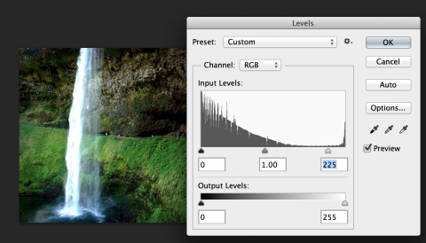
Levels in Photoshop

In Photoshop —

  1. Open your image in Photoshop.
  2. Go to Image > Adjustments > Levels (or use a Levels adjustment layer – see the little half-full/half-empty icon in the bottom of the layers panel?)
  3. You will see a diagram of the levels of your picture. To brighten, slide the arrow on the far right of the diagram inward to the middle until it looks brighter. To darken, slide the arrow on the far left of the diagram inward. Use the arrow in the middle to adjust the image's contrast overall.
  4. Click "OK" to confirm. Using an Adjustment Layer will not destroy your original image! Otherwise, be careful to save a new version, keeping the original image untouched.

In Preview —

  1. Open your image in Preview (Mac only).
  2. Go to Tools > Adjust Color
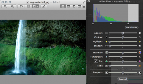
  3. Either: Use the arrows on the left, middle, and right of the levels diagram at the top (see instructions above for Photoshop, as these are the same), or use the Exposure slider to brighten/darken, or use Auto Levels.
  4. Make sure to save a fresh copy so you don't override your original image.

Color Balance

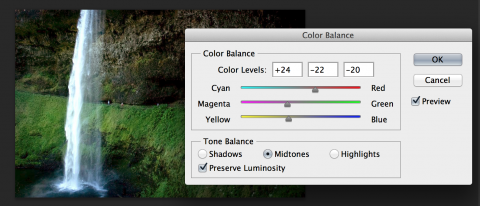
Color balance in Photoshop

In Photoshop —

  1. Open your image in Photoshop.
  2. Go to Image > Adjustments > Color Balance (or use a Color Balance adjustment layer– see the little half-full/half-empty icon in the bottom of the layers panel?)
  3. For each of the tones (shadows, midtones, highlights), slide each of the RGB sliders slowly left and right to find a more balanced color tone for the image. I typically slide them back and forth, seeing extremes on both ends, and then try to find the neutral-feeling "middle" where the color of the photo looks neither one way or another.
  4. Toggle on and off the preview to see how this is effecting your image.
  5. Click "OK" to confirm. Using an Adjustment Layer will not destroy your original image! Otherwise, be careful to save a new version, keeping the original image untouched.

Levels and color balance in Preview

In Preview —

  1. Open your image in Preview (Mac only).
  2. Go to Tools > Adjust Color
  3. Use the Temperature slider to make the image cooler or warmer. You will not have as much control over color balance in Preview as you will in Photoshop.
  4. Make sure to save a fresh copy so you don't override your original image.

File formats

There are three main file format to consider when saving your image for the web. In Photoshop, you'll want to use the "Save for web" option to get to the save dialogue that shows you these format options. Each file format is appropriate for a specific type of image, but the main goal is to make sure your image size is kept as small as possible without impacting the quality of the image.

JPG

The .jpg file format is most appropriate for photographic imagery. Photographs of people and places with many colors and gradients are best presented using the .jpg format, as it can preserve the diversity of color present in the photo's pixels. The .jpg format should get you the best quality balanced with the smallest file size for full-color photos.

PNG

The .png format is the format you want to use if you have transparency in your image. Choose png-24 to get the best transparency support. This format is also best used for when you have a photograph combined with a vector graphic (like shapes, text, etc). The .png file format does a much better job at preserving sharp, contrasting lines than the .jpg file format does when compressed. The .png format will create a slightly larger file size than .jpg for full-color photographs, but you will see better imager preservation than the .jpg format.

GIF

The .gif format is best used for things like logos and simple graphics that do not have gradients of any kind. If you have a two-color graphic or logo, you can use the .gif format. The .gif format does a great job at reducing file size dramatically for images with small numbers of colors. This is the only appropriate use of the .gif format. This format, though it can support transparency, does a bad job at the dithering so it is not recommended.

Text in your images

If you are considering this, be very very sure this is what you want, and here's why. Text in your image is not accessible and requires additional alt attribute information to help people using screenreaders understand your text. If this text is critical to understanding the content of the page, it is not recommended to place the text in the image. Instead, think of text inside images as decorative, adding value to already sufficient content. Now that we have web fonts, it is even more unlikely that you will need to create an image with text inside of it, as we can now create beautiful custom typography on the web that is accessible with webfonts.

I hope this post has been helpful for you to get your images ready for the web. In the next post in this series, we'll talk about how to make your images accessible on your site.

Posted in:
Tags:
Megan Erin Miller Posted by Megan Erin Miller on Thursday, September 12, 2013 - 9:01am

The new Digital Humanities website is a home for discussion and engagement with Digital Humanities at Stanford. Stanford has been active in the Digital Humanities for the last 30+ years, and this activity has been located in many places across campus. The new Digital Humanities website is a place for all these separate groups to come together to share insights and thoughts in the field.

Digital Humanities uses the Stanford Wilbur theme, and features a blog, people profiles, projects, resources, and upcoming events.

Screenshot of the website at digitalhumanities.stanford.edu

Sites Superstars is an ongoing series where we highlight creative, innovative, and just plain excellent websites using the Stanford Sites platform. Have a superstar you'd like to see featured? Contact us.
Posted in:

Pages

Subscribe to Megan Erin Miller's Blog Posts