Skip to content Skip to navigation

Site Retired

As of May, 2022, this website is no longer updated and has been replaced with a static copy.

Megan Erin Miller's Blog Posts

Megan Erin Miller Posted by Megan Erin Miller on Monday, August 26, 2013 - 9:17am

In the last post in this new series on imagery, I reviewed things to consider when choosing a great image for your site. In this post, we'll look at what makes an image the right image, not just a great one.

Now that you have a solid foundation on how to choose a great image by considering the context of your site and how to provide interest through focus, zoom, and contrast, let's talk about the harder part of choosing the right image for a particular page. "The right image?" you may ask. "Isn't a great image good enough?" In a lot of cases, it might be. We might be using images decoratively to add graphical interest to our pages, but I would advocate for thinking a little more strategically about the role that images are playing across your site.

Articulate your goals

Your website should support your organization's goals. Those goals, through careful content strategy and design, should be driving the content and structure of your site. This applies to imagery as well. When your goals drive the strategy for choosing imagery across your site, you will have a more clear idea of what is the right image to choose per page.

For example, let's say you are trying to choose images for the following pages:

  • About us
  • Our location
  • Programs
  • Make a Gift

Now, let's talk about the goals for each of these pages:

  • About usGoal of this page: Help people understand what we do and why we do it (our mission).
  • Our location – Goal of this page: Make it easy for people to find us.
  • Programs – Goal of this page: Highlight our flagship programs and their impact on our audience.
  • Make a Gift – Goal of this page: Show how donations make a difference to real people, and inspire people to donate today.

These seemingly simple and common pages are actually more detailed and complicated in their purpose. To support these goals, we can use careful wording and choose the right imagery to craft the perception our audience has of our organization.

Clear goals lead to the right images

Let's review and brainstorm what kind of image might be the right image (and why) to connect to the goals of each page:

About us

Goal of this page: Help people understand what we do and why we do it (our mission).

Candidates for the right image:

  1. A picture of our team (smiling) - Why? This puts a face on our organization and shows that we are kind and friendly.
  2. A photo of us in the field helping our constituents - Why? This shows the actual work we do that matters and that we are actively helping others.

Which would I choose? I would choose option two because it more clearly supports our goal for people to understand what we do. It addresses what is unique about us. In the caption for the image, we can explain what we are doing and why that particular program/task matters to our constituents.

Our location

Goal of this page: Make it easy for people to find us.

Candidates for the right image:

  1. A photo of the front of our building from the street - Why? So when people are looking for us from the street, they will recognize our building.
  2. A map showing our location in context - Why? So that people can orient themselves to where we are located.

Which would I choose? I would choose both. A location page benefits from having both a map and a photo of the outside of the building to help people recognize your location. I would embed a map instead of using an image.

Programs

Goal of this page: Highlight our flagship programs and their impact on our audience.

Candidates for the right image:

  1. A group photo of people who benefited from the program - Why? To show that our work has a positive impact on real people.
  2. A photo of people working on something related to a flagship program or event - Why? To illustrate the kind of work we do and show how we make an impact.

Which would I choose? I would choose option two because it is more specific and has a more specific story. Showing a close-up photo of a person being helped is more meaningful than a general group photo. That said, if your mission is to serve large numbers of people, then a group photo might be a better choice to demonstrate quantity.

Make a Gift

Goal of this page: Show how donations make a difference to real people and inspire people to donate today.

Candidates for the right image:

  1. A profile photo of a real person who benefited from the program - Why? Smiling photos from people who were helped by your program are powerful and can be linked to a specific, personal story.
  2. A photo of a person receiving help through our program - Why? Showing us in action and helping others illustrates exactly how a donation gets put into effect.

Which would I choose? I would choose option one. A personal story told through a photo and a brief quote is a powerful way to put a real face on the beneficiaries of a donor's generosity.

In conclusion

I hope this post has inspired you to think strategically about which image is the right image for your website content. You can use these methods to develop a documentation strategy that will help your staff collect photos that best represent your organization. Make a list of all the kinds of photos you need, and either take them yourself or hire a photographer to do it for you. Organize your photos by date, and consider also tagging/organizing them by category based on your conclusions after analyzing the goals of each page or section of your site.

Stanford departments and groups can use the SALLIE campus-wide digital asset management system for storing and sharing images and other assets.

Next time...

Next time we'll get a little more technical, and we'll look at tips and tricks to prepare your image for the web, plus ways to do this using Preview and Photoshop.

Posted in:
Megan Erin Miller Posted by Megan Erin Miller on Monday, August 5, 2013 - 9:17am

Choosing great images for your website can be tricky business. In this new series, I'll explain some things to consider when you're selecting and editing images for use on your website. Today, I'm going share some tips for choosing a great image.

Choosing a great image

Consider context

Where will the image be shown?

Ask yourself what page(s) this image will be used on, and for specifically what purpose. The more you can do to understand the role the image will play to your audience, the better. For example, if your goal on a page is to get students excited about an opportunity, you might consider a photo of students who are excited about the opportunity (OK, is that too obvious?).

Does your CMS automatically crop the image a certain way?

If you are using a Content Management System (CMS) like Wordpress or Drupal, it is very likely that the page you are going to put your image on will automatically crop and scale the image for you. Check with your webmaster or website documentation to better understand if this is happening (or just test it out by making a test page and uploading an image to it). You can also look at an existing page and use Firebug or Web Developer Tools to inspect the image and see what size it is on the page. In knowing the final dimensions or whether your CMS crops the image a certain way, you can better prepare your image (by making it the correct ratio or dimensions ahead of time in Photoshop). This most often impacts image choice if you know that you need a portrait vs. a landscape ratio photo.

Is the image going to be used on one page, or used across multiple pages?

Often in content management systems, your content will get reused across your website in multiple ways. For example, a news story might show up on the homepage with a thumbnail of the image, and also show up as a featured news item in the news section with a larger version of the image. Consider all these contexts as you are choosing your image, and make sure that the image you choose can work well in all contexts.

Provide interest

Is it focused on the right thing?

An image with fuzzy focus, or focus set on the wrong subject can make your website look unprofessional. Make sure to look carefully at your images and choose one where the focus is clear and on the correct subject. When choosing images of people (profile photos), the most important thing to have focus is the eyes. We as humans are very attentive to eyes, as they are a big part of non-verbal communication. Having clarity of focus on the eyes in a profile photo will make sure your photo looks professional.

Is it too zoomed in or out?

Level of zoom, and careful consideration of what the subject of the photo actually is, is important. For example, you could have a zoomed out photo of a crowd at an event, which you may think gives off a fun energetic vibe, but in reality, crowd photos tend to fall flat on the web without a specific point of interest. You might do better cropping in to capture real emotions on people's faces in the crowd, or choose a photo with a clear subject (a single or a couple of people is a good bet). Zooming in on the details and cropping out unecessary detail is a great way to turn a mediocre image into a great one. Below is an example of OK and better cropping of the same image:

Example of good cropping

Is there enough contrast?

When selecting a good image, make sure that the subject of the image has enough contrast with the surroundings. You want your subject to be set apart from the background via contrast (either through levels or color). In the example below we see not-so-good contrast between the student, the hammock, and the surroundings on the left, and a better example where the student stands out from the background because of color and luminosity contrast.

Example of good contrast

Next time...

In this post we've explored some things to consider when selecting a good quality image for your site. In the next post in this series, we'll explore how to choose the right image for your website and how to add meaning and emotion to your site through imagery.

Posted in:
Megan Erin Miller Posted by Megan Erin Miller on Wednesday, July 3, 2013 - 9:21am

I spend a lot of my time theming in the browser, writing CSS and testing ideas. In this blog post, I wanted to share some of my favorite tools for designing and theming.

In-Browser Tools:

Web References:

Desktop Tools:

Do you have any favorite tools for designing and theming? I'd love to hear from you in the comments.

Posted in:
Tags:
Megan Erin Miller Posted by Megan Erin Miller on Wednesday, June 12, 2013 - 2:50pm

Social media could be said to be the new "press release," a concise way to get your latest updates out to an interested audience. If you're using Twitter or Facebook, here are a couple of quick and easy ways to integrate your social media content into your website.

Embedding Your Twitter Feed

Twitter provides a really awesome tool for creating embedded widgets at https://twitter.com/settings/widgets/new. Here you can choose whether you want to embed your tweets, your favorited tweets, tweets from a list you have created, or tweets that contain a search term, or hashtag (e.g. #cats). Typically you would want to choose your "User Timeline," tweets that you have sent, but if you are creating a website for an event or community, you might want to consider a hashtag search instead, using the hashtag that you are using for the event or community (e.g. #SUDrupalCamp).

Once you have chosen what kind of thing to embed, you can customize the way it looks by adjusting the height, theme, and link color. Click the "Create Widget" button to grab your embed code, and paste it anywhere in your website or template where full HTML is allowed. If you are using Drupal, make sure to set the WYSIWYG to "Full HTML" to enable the embed code to work properly.

Adding a Tweet Button

Example Tweet button

Let's say you want people to be able to tweet about your website or content. You can very easily create your own custom Tweet button at https://twitter.com/about/resources/buttons. Choosing the first option, "Share a Link," you can specify a custom URL, custom tweet message (this lets you customize what the tweet will say by default), and additional details. If you set a custom message, be sure to test your tweet (by clicking the tweet button example on the right) to make sure you are within the 140 character limit. Once you are done, just copy and paste the code snippet into your website or template where full HTML is allowed.

Adding a Like Button

Example Like button

Facebook also has an online widget creator for adding "Like" buttons to your site found at https://developers.facebook.com/docs/reference/plugins/like/. This lets people share your website on their timeline by "liking" it. Scroll down to the "Configurator" section of the page to create your button. Here you can customize what style of button you want, whether it will show the count (of how many people like it) or faces (profile pics of people who like it), and choice of fonts and visual style.

Once you click "Get Code," you will be presented with a couple of options. If you are able to edit the template for your page, consider the first option which requires adding a script in addition to the button code. You could also consider the iFrame option as it is simpler and just one element to copy/paste into a full HTML part of your site.

Embedding Your Facebook Timeline

If you are interested in embedding your Facebook activity into your website, there are instructions and a code generator at https://developers.facebook.com/docs/reference/plugins/activity/. Now this one is a little less intuitive, in that it is taking all activity happening everywhere on Facebook that refers to your website. It is not taking your Facebook page timeline and embedding your posts. Refer to the documentation to customize this widget – it can be very cool if your site has a lot of activity on Facebook.

This has been an introduction to some common ways to integrate social media into your website – I hope this has been helpful! How do you integrate social media on your site? I'd love to hear from you in the comments.

Posted in:
Megan Erin Miller Posted by Megan Erin Miller on Monday, June 3, 2013 - 9:00am

This is the fourth post in my series, Styling on Sites. In my last post we looked at the new responsive theme Open Framework, and how we can use Bootswatch subthemes to quickly style our Sites site. Today, I'm going to share something awesome. Font Awesome.

What is Font Awesome?

Font Awesome is built-in to Open Framework theme. It provides a set of web-friendly, vector icons through the inclusion of a custom webfont. By using a particular html markup, you can add these icons to your Stanford Sites website. The code looks like so:

<i class="icon-home"></i>

Which gives you an icon like this:

You can increase the size of your icons by adding additional classes, such as:  icon-large (33% increase), icon-2x, icon-3x, or icon-4x.

Which results in:

How can we use Font Awesome in our Drupal sites?

Anywhere you are allowed to use Full HTML you can place this code. You can also consider editing your available text formats to allow for the "i" tag (and classes added to it) to the WYSIWYG that you use regularly. Do this by visiting: Configuration > Content Authoring > Text Formats. Edit the text format of your choosing (Content editor ideally) to add the "i" tag to the WYSIWYG Filter settings at the bottom (add: i[class]).

A note: Drupal does not allow you to have HTML code in your menu items. You might be very tempted to add these icons to your menu items, but unfortunately this is not possible. You can however add this code to a views re-write (e.g. you could add a video icon next to a "watch video" link underneath each post), and to any block or node content body.

Want Font Awesome in Photoshop?

If you are working on your web design in Photoshop or Illustration, you can very easily install the font locally on your computer, and refer to the Font Awesome Cheat Sheet to get the character codes.

Some Examples

Here are just a few examples of how you might use Font Awesome:

Watch Video

Download

Menu

Next

What's great about this technique is that you can target the "i" tag in your CSS independently of the rest of the font, link, or button. For example: a i { font-size: 1.2em; opacity: 0.8; } will get you a slightly larger icon (than the rest of the link text), and lighten the color of the icon using opacity. You can go a lot further with this as well, specifying any CSS properties that you normally would using a regular font.

And that's why Font Awesome is awesome. Enjoy!

Posted in:
Megan Erin Miller Posted by Megan Erin Miller on Thursday, May 23, 2013 - 9:00am

This is the third post in my series, Styling on Sites. Last time we looked at how to use the great and powerful module, CSS Injector. In this post I'm going to introduce you to our new responsive base theme, Open Framework.

Introducing Open Framework

As of April 9th, all Drupal 7 websites on Stanford Sites now have access to the new responsive theme, Open Framework. This theme was developed in-house at Stanford Web Services, and it is open source and based on Bootstrap (formerly known as Twitter Bootstrap). It provides a set of responsive block regions that enable you to build complex responsive layouts, just by placing blocks in the appropriate regions.

To get started taking advantage of Open Framework, build some blocks. These can be menu blocks, views block displays, or custom blocks. Use the Regions Demo Page on Open Framework to figure out which region to drop blocks into in order to get the layout you want.

If you want to learn more about site building using Stanford's themes, watch this video:

(If you are interested in learning even more about our family of Drupal 7 themes, check out this video: Introduction to Stanford's Repsonsive Drupal Themes.)

Open Framework Theme Options

To access the theme options for Open Framework, navigate to: Appearance > Settings > Open Framework. Here you can toggle on and off the logo, title, slogan, menus, etc. You can set a custom logo, shortcut icon, and hide/show breadcrumbs. You can choose a custom background image, or choose a border style. This can help with some default styles that you want to implement on your site.

Customizing Open Framework

Open Framework gives you a good foundation to get started with your site (you get all of Bootstrap and more!), but it is also a great jumping off point for adding on a layer of custom styles. For those of us on Stanford Sites, we can use CSS Injector to add style overrides to customize the look and feel of our site, but if you are using Open Framework on a different hosting solution, feel free to create your own subtheme to store all of your custom styles. Read my second post in this series for instructions for using CSS Injector to customize styles.

Using what's out there: Bootswatch

What's great about using a popular framework like Bootstrap, is that thousands of people around the world are working with the same framework, and there are a lot of great examples of how you can customize Bootstrap styles. One of those great examples is Bootswatch. We can take some CSS from one of the Bootswatch themes, and apply it directly to our website using CSS Injector. This is a fast and easy way to spruce up your Open Framework website.

Here's how it's done:

  1. Find a theme on Bootswatch that you like. In this case, I've chosen the Amelia theme.
  2. Click download and choose the bootstrap.css file.
  3. Open the CSS file, and copy all of it.
  4. Create a new CSS Injector rule.
  5. Paste in the Bootswatch theme CSS.
  6. Make sure to set your rule to exclude the following paths so that you only see the styles on the front-end of your site:
    admin
    admin/*
    node/add/*
    node/*/edit
  7. Save your rule.
  8. Voilà!

My site went from drab:

Open Framework

To fab:

Bootswatch theme

You may need to do a little cleanup or custom CSS to really make it look good, but hey! This gets you that much closer to your own custom theme.

Posted in:
Megan Erin Miller Posted by Megan Erin Miller on Tuesday, April 9, 2013 - 12:49pm

A new family of Drupal 7 themes have been released on Stanford Sites as of the evening of April 9th:

  • Open Framework — a responsive, full-featured base theme that uses Twitter Bootstrap styles. It does not include Stanford branding.
  • Stanford Framework * — a base theme specifically designed for Stanford that includes approved Stanford branding and styles. Stanford Framework is based on Open Framework.
  • Stanford Wilbur * — a robust, stylized subtheme based on Stanford Framework. Ready to use without any additional styling. Stanford Wilbur is based on Stanford Framework.
  • Stanford Jordan * — a robust, stylized subtheme based on Stanford Framework. Ready to use without any additional styling. Stanford Jordan is based on Stanford Framework.

* Stanford-branded themes are available by request for official university group and department websites.

Learn more about the themes release, and see demos of each theme online at http://drupalthemes.stanford.edu

Migrating from another theme

For those of you using Stanford Modern (or any other non- Open Framework based theme), there are a few things to consider if you want to switch to use any of the new themes:

Block regions have changed

You will need to re-assign your blocks to the appropriate regions in your new, Open Framework based theme. For example:

  • The Search Form block needs to be placed in the "Search Box" region.
  • Content placed in the "Page: Feature section" region in Stanford Modern will need to be moved to an appropriate region such as "Highlighted."

To edit your blocks, either hover over the block to click "Configure Block" from the gear drop-down on the top right, OR go to the Blocks administration page and configure each block. If you are using Context, you will need to go to the appropriate context to edit placement of the blocks.

To learn about Open Framework (and its subthemes) block regions, please visit the block regions demo page. This page can help you map your blocks to a new region. Learn more about Open Framework's responsive block regions by watching this Tech Briefing presentation.

CSS Injector styles may not apply or break

If you have any hand-coded CSS Injector styles, you may need to re-write these or discard them as they will most likely not be applicable in the new theme. To quickly test this, just switch the configuration on your CSS Injector rule to only show on the following pages: do-not-show (or make up some other non-existing page name). If this fixes any weird styling issues you see, it probably meant that your CSS Injector rule was not applying correctly in the new theme.

You will need to evaluate each rule to see whether you can discard, edit, or change the rule to apply to the new theme.

The new Admin Shortcuts region

Open Framework family of themes has a new Admin Shortcuts region that is visible only to authenticated users. We use this region to add shortcut links, or other useful content for authenticated users. We have found this to be very useful in addition to using the Admin Menu bar.

You may see some of your blocks appearing in this region when you switch themes. You will need to move those blocks to a different region on your page for them to be visible to anonymous users of your website. Please only use the Admin Shortcuts region for quicklinks and other helpful administrative links for your authenticated users.

Tactics for performing the theme switch

It may take a little time to get all your blocks placed correctly, fix the CSS Injector styles if you have them, and make sure your site looks OK.

For non-Stanford Sites Drupal 7 websites, you can use the switch theme module to switch the theme for a particular user or role.

For Drupal 6, you can allow users of a certain role (e.g. admin) to choose their own theme. In this fashion, you as admin can change the theme just for you, perform the necessary adjustments to block configurations and then when you are ready, switch the theme for the whole site.

For websites on Stanford Sites, you can request a dev site on which to do testing of your themes and come up with a strategy for updating your production site. Follow this documentation: https://itservices.stanford.edu/service/web/stanfordsites/userguide/backups_and_development

Questions?

If you are encountering any issues with using the new themes, please file a HelpSU request at http://helpsu.stanford.edu/helpsu.cgi?pcat=webdesign and we will respond as soon as possible.

Posted in:
Megan Erin Miller Posted by Megan Erin Miller on Monday, April 8, 2013 - 8:50am

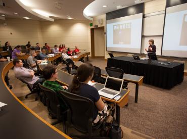
Thank you all for attending Stanford Drupal Camp 2013! The event was a great success, and couldn't have happened without everyone who helped organize, volunteer, sponsor, and present. It was really wonderful to see the community come together, and we look forward to continuing the conversation with you all!

Posted in:
Tags:
Megan Erin Miller Posted by Megan Erin Miller on Thursday, April 4, 2013 - 3:21pm

We are excited to announce the upcoming April 9th release of four new mobile-responsive Drupal 7 themes for the Stanford community:

  • Open Framework — a responsive, full-featured base theme that uses Twitter Bootstrap styles. It does not include Stanford branding.
  • Stanford Framework * — a base theme specifically designed for Stanford that includes approved Stanford branding and styles.
  • Stanford Wilbur * — a robust, stylized subtheme based on Stanford Framework. Ready to use without any additional styling.
  • Stanford Jordan * — a robust, stylized subtheme based on Stanford Framework. Ready to use without any additional styling.

These themes will be available starting April 9th for websites hosted on Stanford Sites, Drupal on the Collaboration Tools Installer, as well as websites using other hosting services.

* Stanford-branded themes will be available by request for official university group and department websites.

To see demos of each theme and to learn more about the upcoming release, visit http://drupalthemes.stanford.edu

If you want to see these themes in action, join us at Stanford Drupal Camp, April 5-6 at the Stanford Law School. Here are two sessions not to miss:

(Haven’t registered yet for Drupal Camp? It’s not too late! Register now)

Posted in:
Tags:
Megan Erin Miller Posted by Megan Erin Miller on Thursday, March 14, 2013 - 5:17pm

less is more graph

When it comes to reaching your readers, less is more. When you are adding blocks and content to your site, ask yourself, "Does this help my reader find the thing they are looking for?"

What is the primary task you are trying to get them to do on your site? Is it being overshadowed by all the other things on the page? How can you reduce the amount of content on each page and make the message simple?

Just some food for thought on a Thursday afternoon.

Pages

Subscribe to Megan Erin Miller's Blog Posts